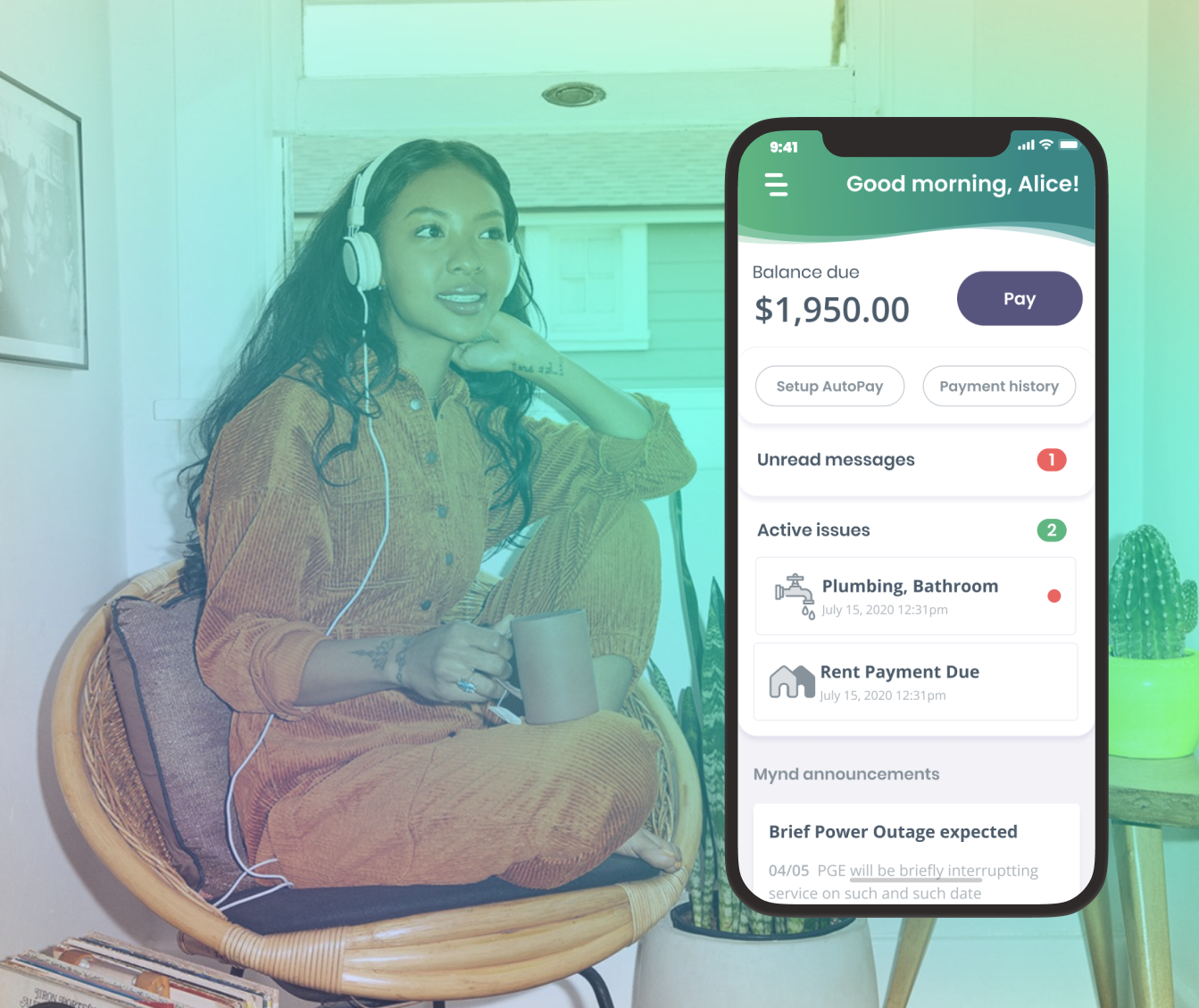
In the realm of tech-enabled property management, the Resident App often feels like a necessary evil. It's primarily used for tasks like paying rent and reporting maintenance issues—things residents would rather avoid. Our project aimed to transform this experience into something seamless and enjoyable. We envisioned a resident ecosystem that continuously evolves to simplify renters' lives.
We weren't starting from scratch. When I joined, there was already a basic app that our residents had been using for years to pay rent or request maintenance. However, as the company entered a high-growth phase and was onboarding hundreds of new residents each month, the limitations of the current mobile experience became apparent.
2016
(Old Resident App)
2019
(Lead Product Designer)
2024
(Design Director)
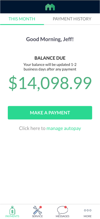
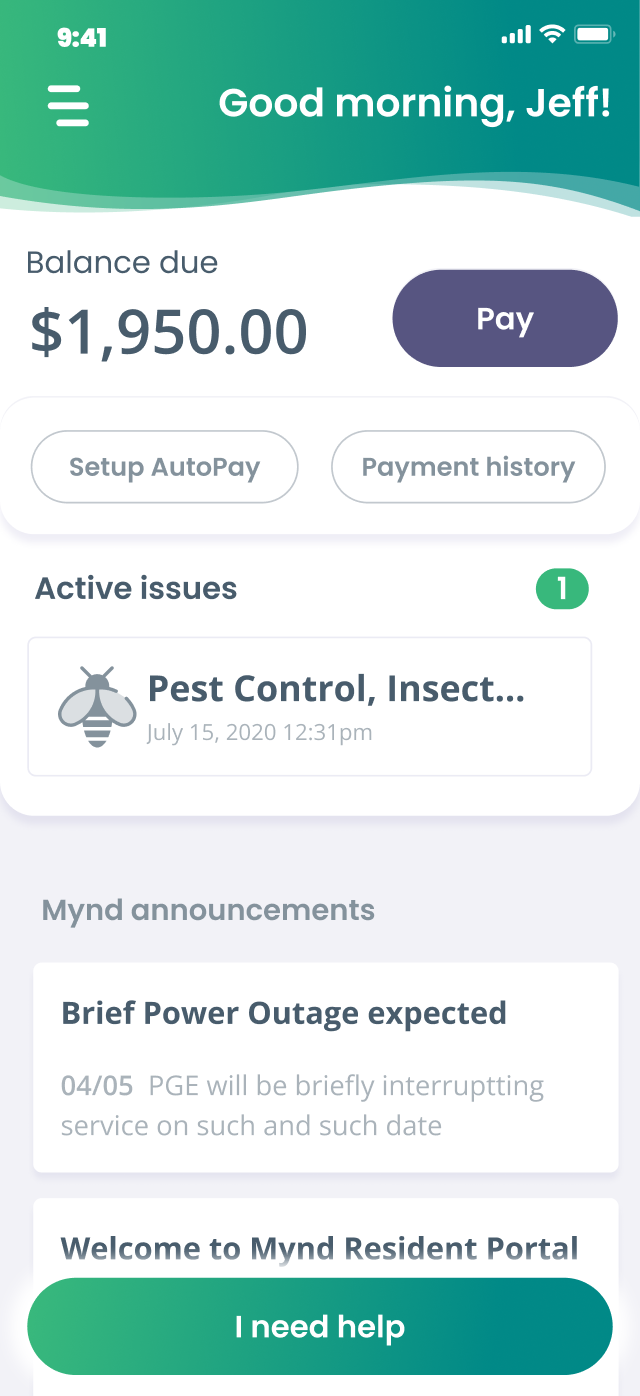
The app's functionality was limited to paying rent, sending messages, and creating service requests. The user interface was outdated and did not align with the Mynd brand at the time. The biggest obstacle was its lack of modularity, which hindered our mission to create a comprehensive resident ecosystem.
We decided to start anew and design a modern mobile platform for residents.
The good news was that we had a large and vocal user base. It was simply a matter of getting them on a Zoom call to discover their needs and pain points.
We sent out surveys to all our residents and received nearly 400 responses about how they used our app. We categorized the feedback into dozens of feature requests, bugs, and UI/UX issues.
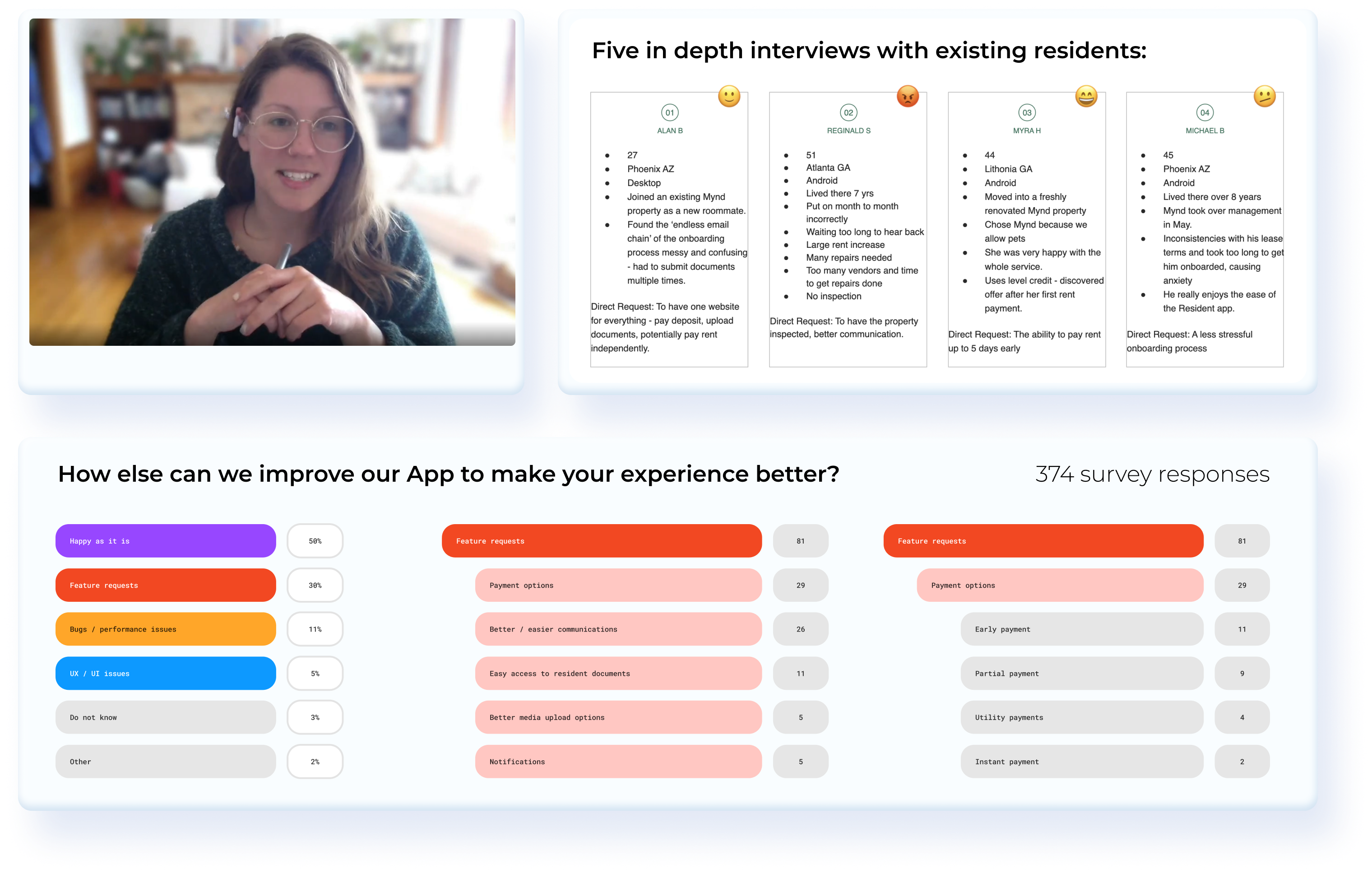
We then conducted in-depth interviews with some of our most vocal users to gain firsthand insights into their experiences.
While half of our users appreciated the app as it was, the other half provided numerous suggestions for modernizing the mobile experience to simplify residents' lives. Many suggestions focused on improving operations and service, but our analysis highlighted several key product insights to prioritize:
Messy communication
Too many message threads to follow whenever something important is happening (moving in, getting security deposit back, etc..)
Few payment options
Residents want to be able to pay early, pay in instalments, pay rent and utilities together and have better tools to split rent between room-mates.
Confusing onboarding
Leasing and Resident flows were disconnected & new residents had to create new accounts and use different apps as an applicant vs a resident
Couldn’t easily check their lease
To get information about their lease terms, Residents had to email the property manager and even then the lease was in confusing legalese
Many service requests were incomplete
A lot of the Service Requests sent through the app did not have the helpful photos and detailed description, which necessitated redundant (and expensive) inspection visits from our vendors
Once we identified and prioritized the opportunities for the first version of the new Resident App, all designers were involved in generating as many low-fidelity and mid-fidelity ideas as possible.
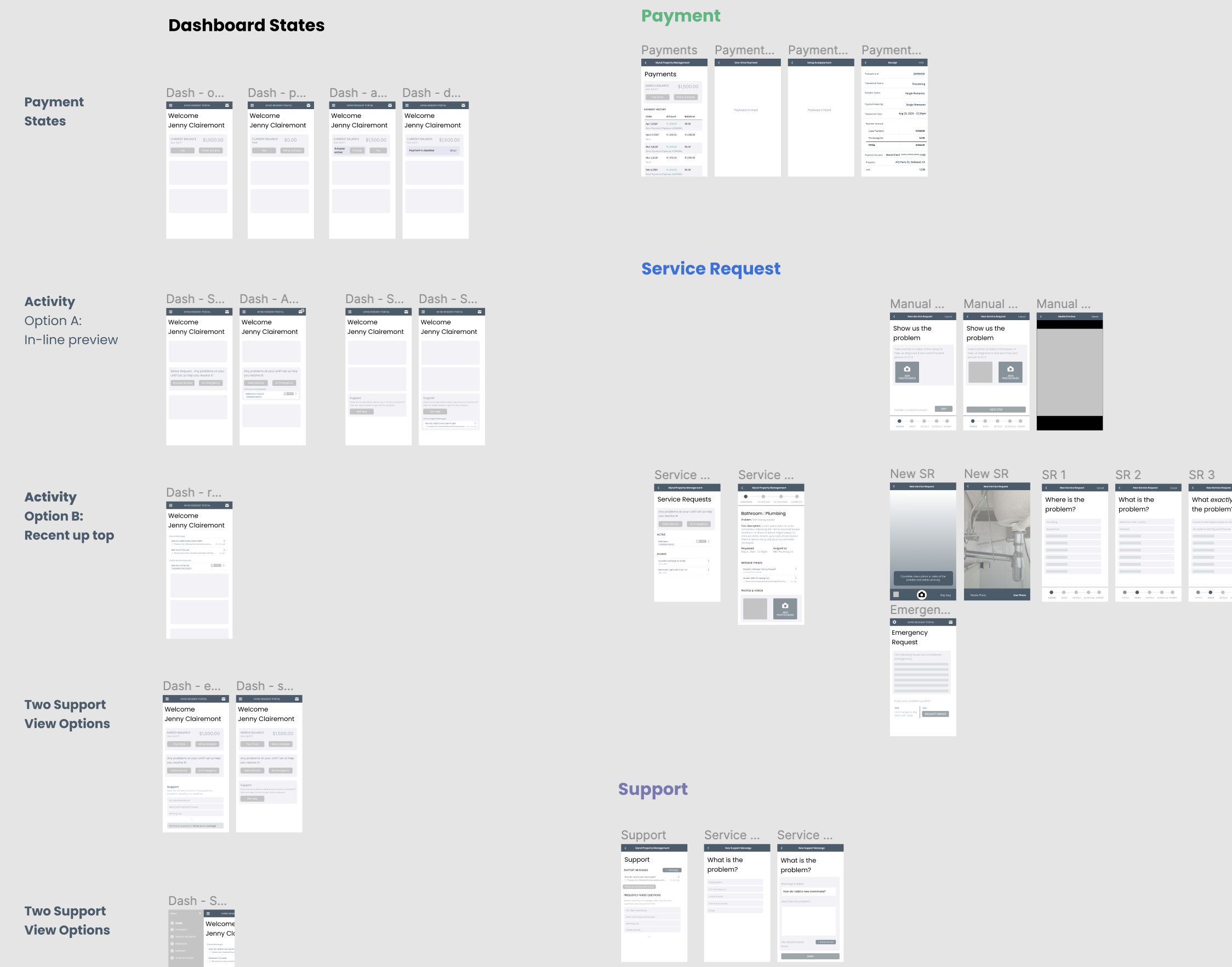
After numerous discussions with users and stakeholders, who all had strong opinions about our flagship mobile app, we developed an ideal user flow for Phase 1 and began crafting the design language for the user experience.
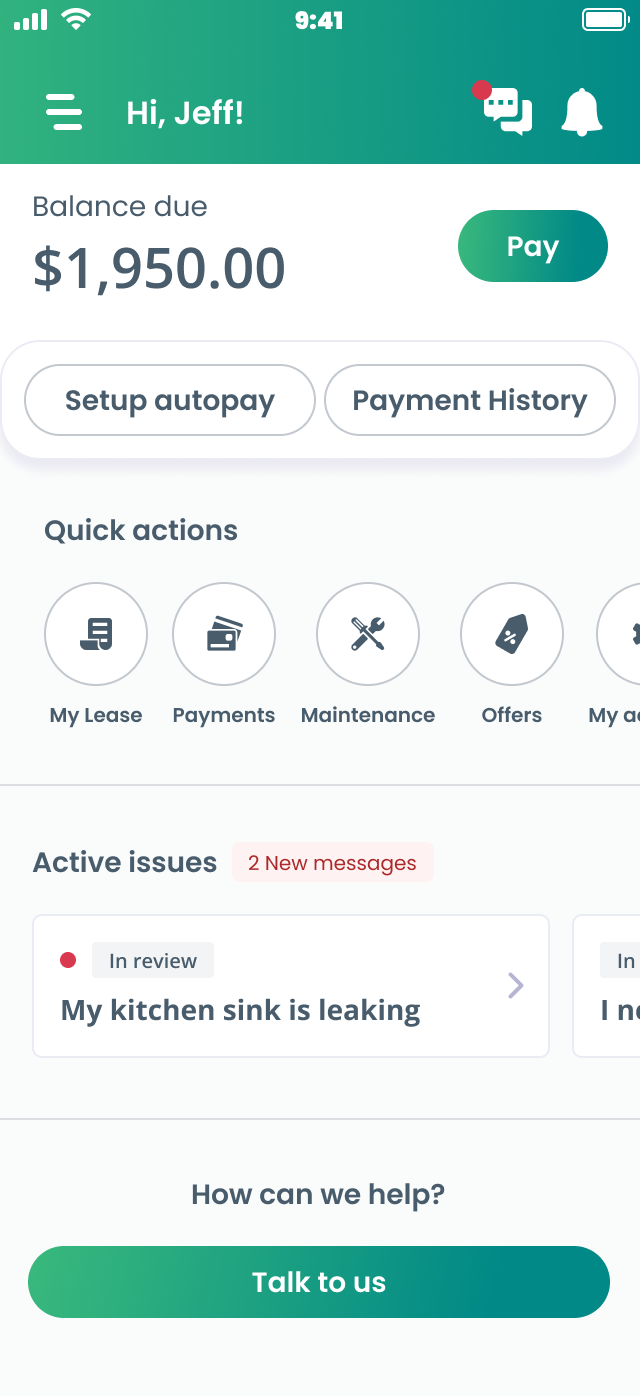
I collaborated closely with our marketing team to develop the style, typography, color palette, icons, and interaction design for this consumer-focused app. We chose a bold, colorful layout with large text and easy-to-press buttons. Usability research showed that this design system would be the most accessible for our diverse user base.

Loading animation

Menu animation
.png)
Icon library
With the design approved, we proceeded to develop a comprehensive interactive prototype, covering all potential user flows, edge cases, and error or empty states.
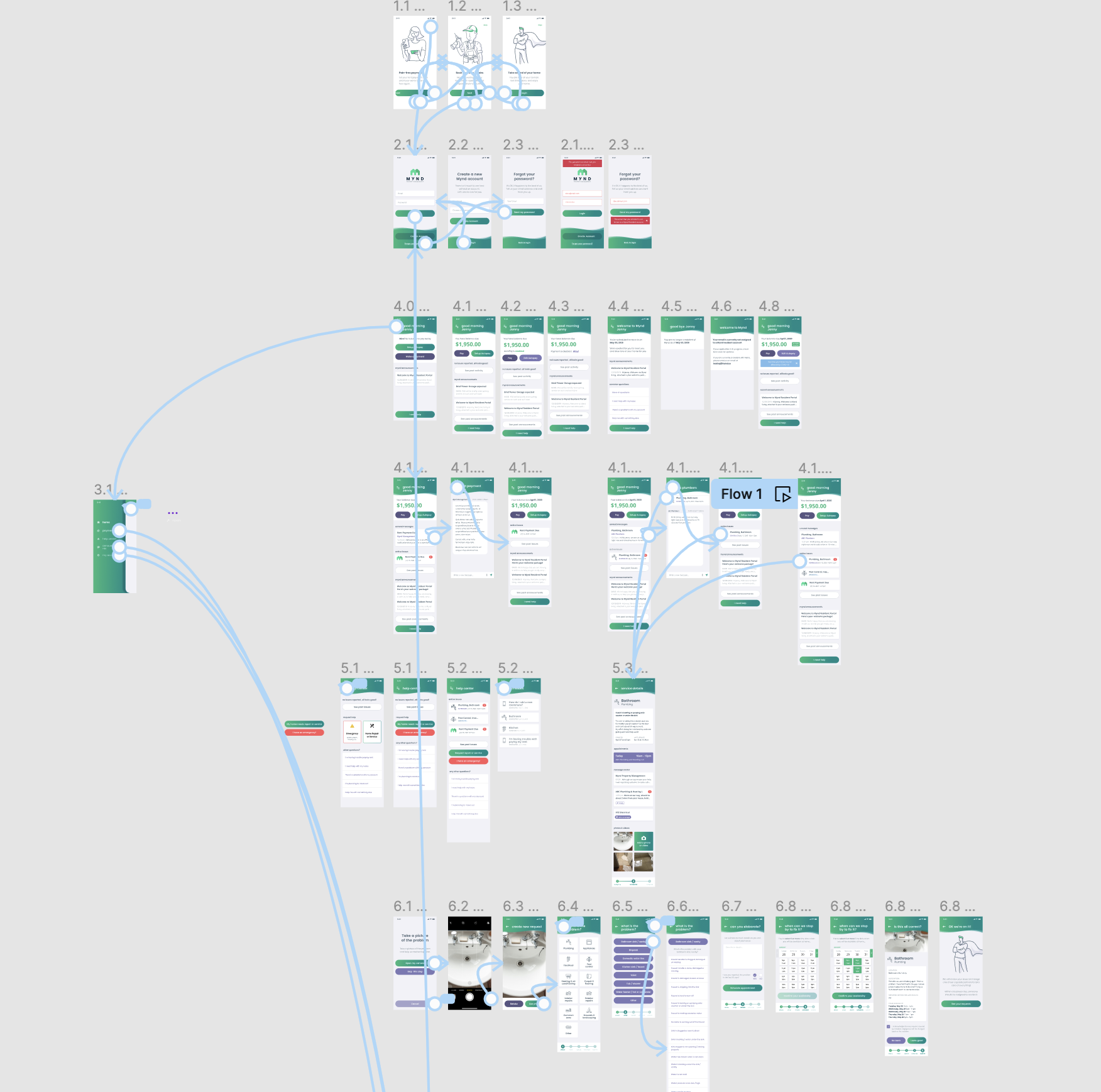
You can try it here! However, please note that it’s quite old, and some links may no longer be functional.
The prototype underwent numerous iterations following extensive usability testing and was launched to great acclaim. This led to increased adoption, a higher number of service requests created and scheduled entirely within the app, and a significant reduction in support tickets.
One of our primary objectives was to develop the app into a Resident Ecosystem, allowing for the integration of more tenant experiences and reducing the reliance on endless email and message threads that frustrated users and demanded significant time from our support staff.
This is where the new app truly demonstrated its value! Over the following years, we gradually introduced additional features:
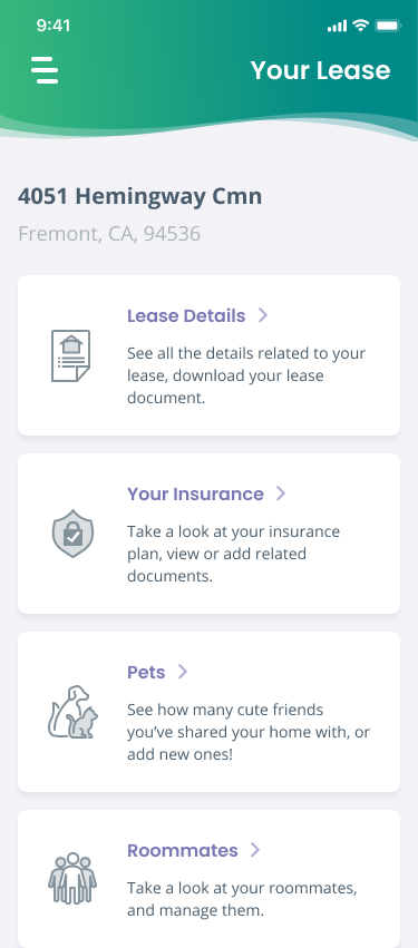
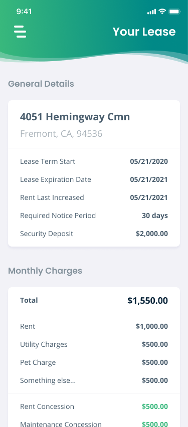
Down with legalese! We added a Your Lease section where a resident can read their lease conditions and rent breakdowns in plain English (other languages coming soon!)
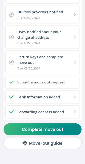
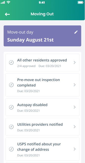
Why make residents sift through dense PDFs during the already stressful move-out process? With interactive checklists, we guided tenants and reduced the workload for our property management and support staff.
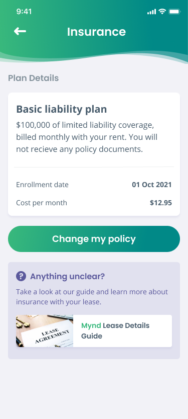
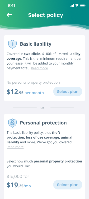
Residents can explore and choose tenant insurance directly through the app via our insurance partners or manually input their existing policy.
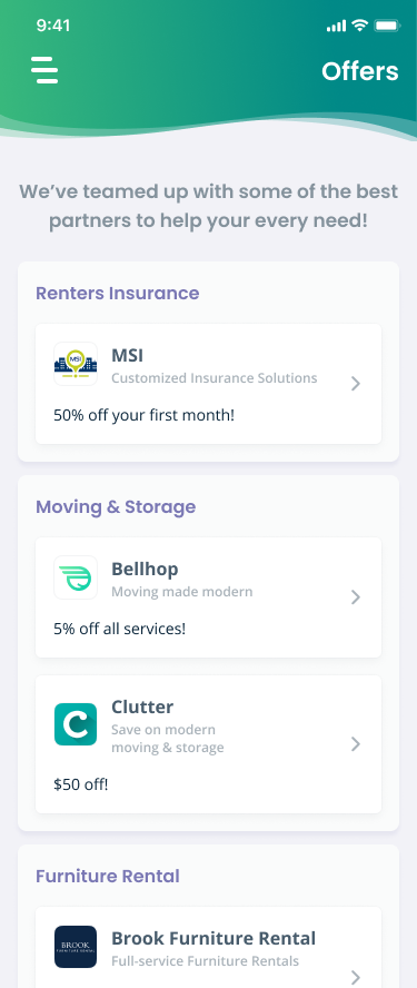
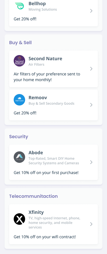
We leveraged our scale to collaborate with various quality-of-life services, offering exclusive discounts to our residents on insurance, moving, and storage, with more planned for the future.
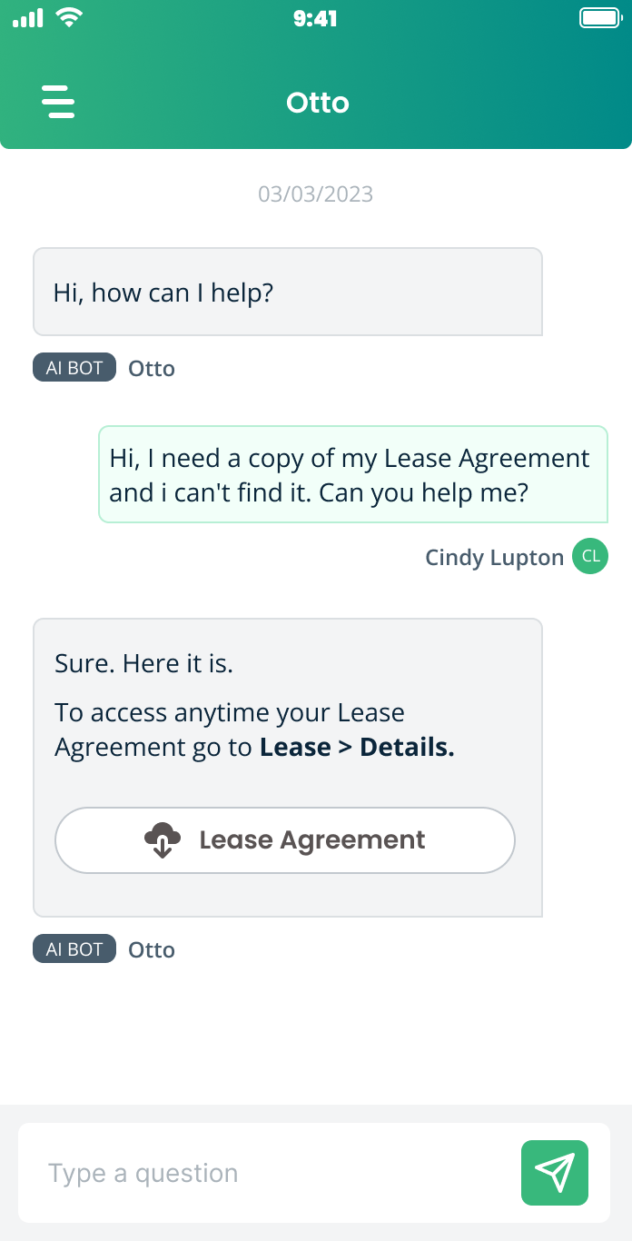
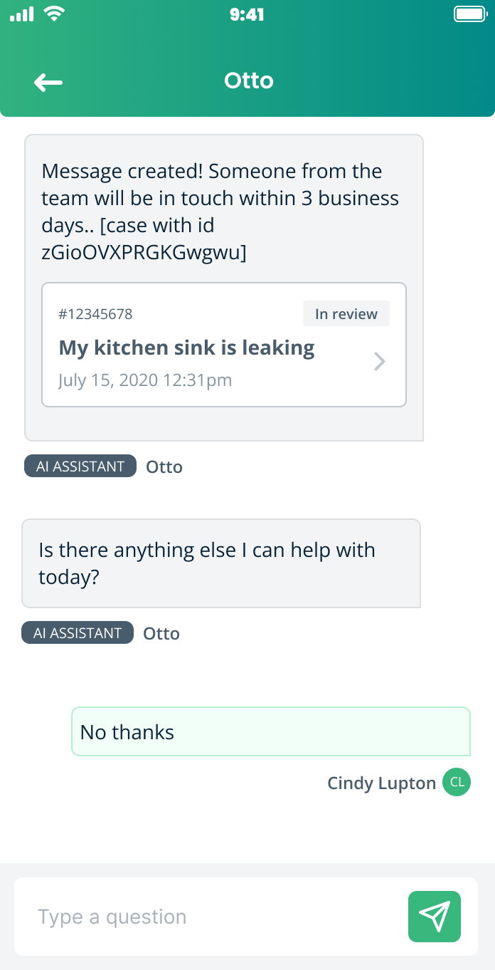
With the rise of GenAI, we aimed to simplify our residents' lives further. As the Director of Design, I helped establish the new AI team to develop a conversational bot capable of answering common questions about leases, payments, and service requests.